15 Jul How a good graphic can elevate your proposal
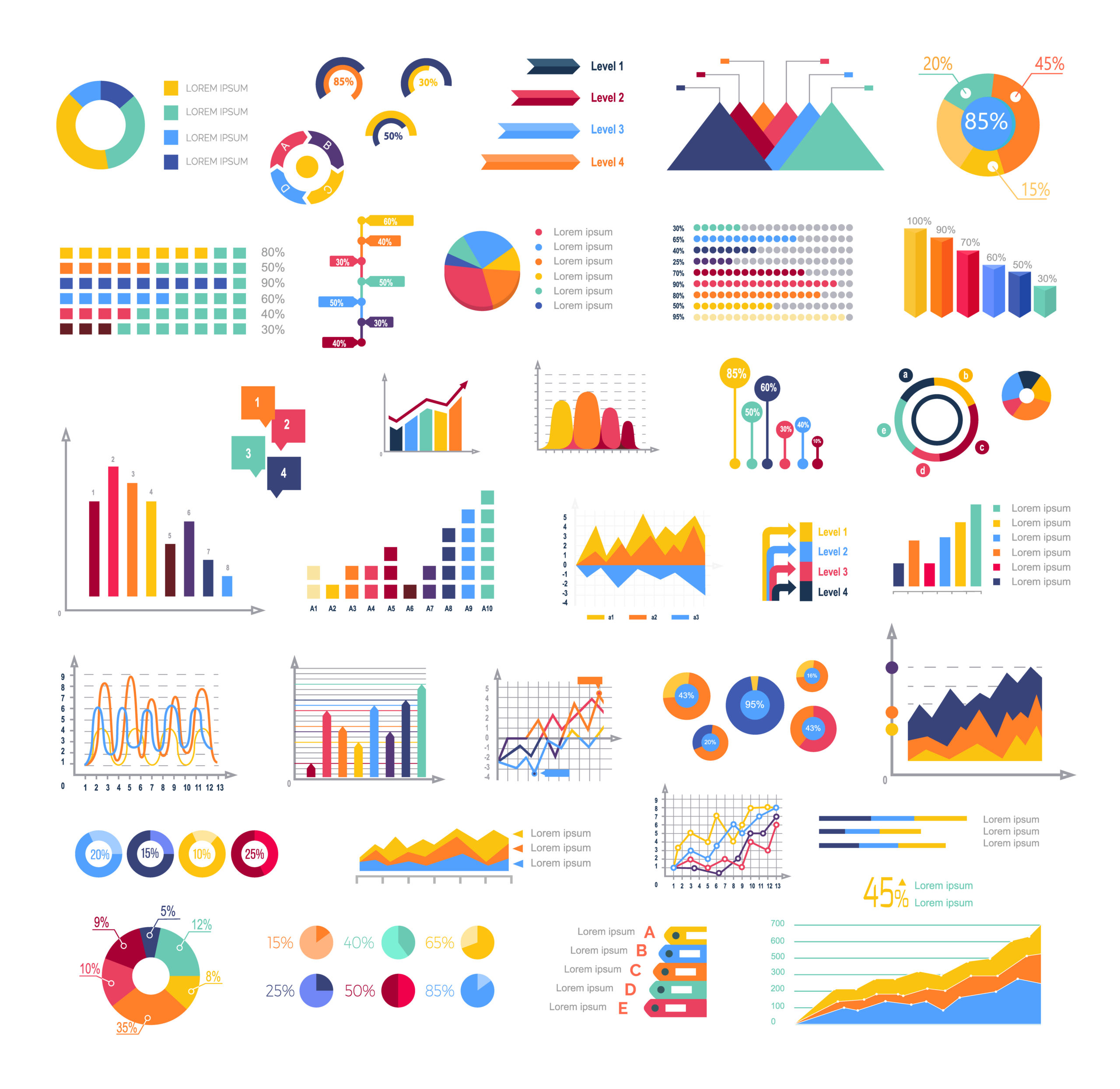
Graphics are often debated in the tender process, there are some who will utilise them to the max, when allowed, and then those who use very few. Whichever school of thought you are a well-placed infographic can help set out your proposed solution clearly and provide a visual representation which some may find easier to understand than a paragraph of text trying to explain the same message.
Firstly, the most important factor to check before designing expensive graphics is to check if they are allowed in the tender response. Frequently buyers state that no graphics can be used or the words within them contribute to the word count – so they must be used with some caution and restraint. If there is any uncertainty, it is always worth a clarification question to confirm what is and isn’t allowed.
Showing key elements of your proposal as a graphic rather than text can make understanding it easier and also more accurate. In breaking up text, you can positively affect the assessor’s emotional response and influence how they look at the remaining response.
As with good design, a graphic shouldn’t need explanation. There should be no need to expand further. If too much explanation is required to support the graphic, it hasn’t served its purpose effectively.
Keep the design of your graphics consistent throughout, ensure that the formatting is the same; headings, font size and type and brand colour scheme etc.
Benefits of Good Graphics
- Used to visually communicate key points
- Breaks up bodies of text to add interest to the reader
- Shows an understanding of the buyers need
- Explain complex points without needing to use the whole word count
- Images and graphics can enhance emotive feelings
- Demonstrate processes effectively if there are stages, steps or phases
When selecting graphics stick to a few simple rules, make them relevant, easily understandable and keep them uncomplicated.
